
^Module Build^
Image Section - v01
Hover Over Chevron Icon below Image to view info of image. Image opens in Lightbox
Issues: Info in Blurb Module needs to be in Single Paragraph form, i.e. no spaces per line

Blurb Module
– Section –
– Row –
Image (opens to Lightbox)
Icon on Static Load (Desktop)
Full Text on Hover
– Row –
Divider (Design, Sizing, Min Height = 300px)
Blurb Module
Your content goes here. Edit or remove this text inline or in the module Content settings. You can also style every aspect of this content in the module Design settings and even apply custom CSS to this text in the module Advanced settings.
Image Section - v02
Chevron Icon with Blurb above Image
Issues: Duplicate image in background may be distracting?
Background Image is within Column Settings > Content
Blurb Module
Blurb
Icon on Static Load (Desktop)
Full Text on Hover
Image (opens to Lightbox)
Divider

Your Title Goes Here
Your content goes here. Edit or remove this text inline or in the module Content settings. You can also style every aspect of this content in the module Design settings and even apply custom CSS to this text in the module Advanced settings.
Blurb Module
– Row –
Blurb
Icon on Static Load (Desktop)
Full Text on Hover
Image (opens to Lightbox)
Divider
Your Title Goes Here
Your content goes here. Edit or remove this text inline or in the module Content settings. You can also style every aspect of this content in the module Design settings and even apply custom CSS to this text in the module Advanced settings.
Image Section - v03
Blurb Module with solid background
Blurb Module
– Row –
Blurb
Icon on Static Load (Desktop)
Full Text on Hover
Image (opens to Lightbox)
Your Title Goes Here
Your content goes here. Edit or remove this text inline or in the module Content settings. You can also style every aspect of this content in the module Design settings and even apply custom CSS to this text in the module Advanced settings.
Image Section - v04
3 Columns: Blurb above Image
Blurb Module
– Row –
Image (opens to Lightbox)
Icon on Static Load (Desktop)
Full Text on Hover
Your Title Goes Here
Your content goes here. Edit or remove this text inline or in the module Content settings. You can also style every aspect of this content in the module Design settings and even apply custom CSS to this text in the module Advanced settings.
Your Title Goes Here
Your content goes here. Edit or remove this text inline or in the module Content settings. You can also style every aspect of this content in the module Design settings and even apply custom CSS to this text in the module Advanced settings.

Text Module H4
H4 added to content.
Image to Content Ratio: 40/60
Image: Design > Border > Round Corners = 6px
Box Shadow Blur = 10px
Open to Lightbox: true
Canada Thistle
Cirsium arvense (L.)
Canada thistle plants flower for at least two growing seasons.
Text Module H4
H4 added to content.
Image to Content Ratio: 50/50
Image: Design > Border > Round Corners = 6px
Box Shadow Blur = 10px
Open to Lightbox: true
Canada Thistle
Cirsium arvense (L.)
Canada thistle plants flower for at least two growing seasons.
Gallery: Grid, Landscape
Image Title and Caption via Media Library
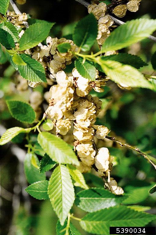
siberianelm-foliageseeds
Siberian elm is known for releasing prolific amounts of papery seed pods, which can become a nuisance in the urban settling
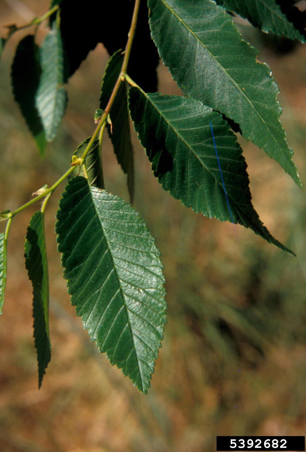
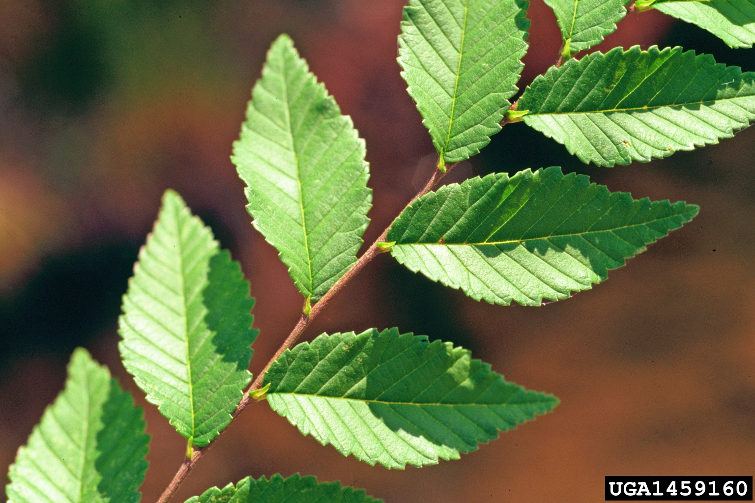
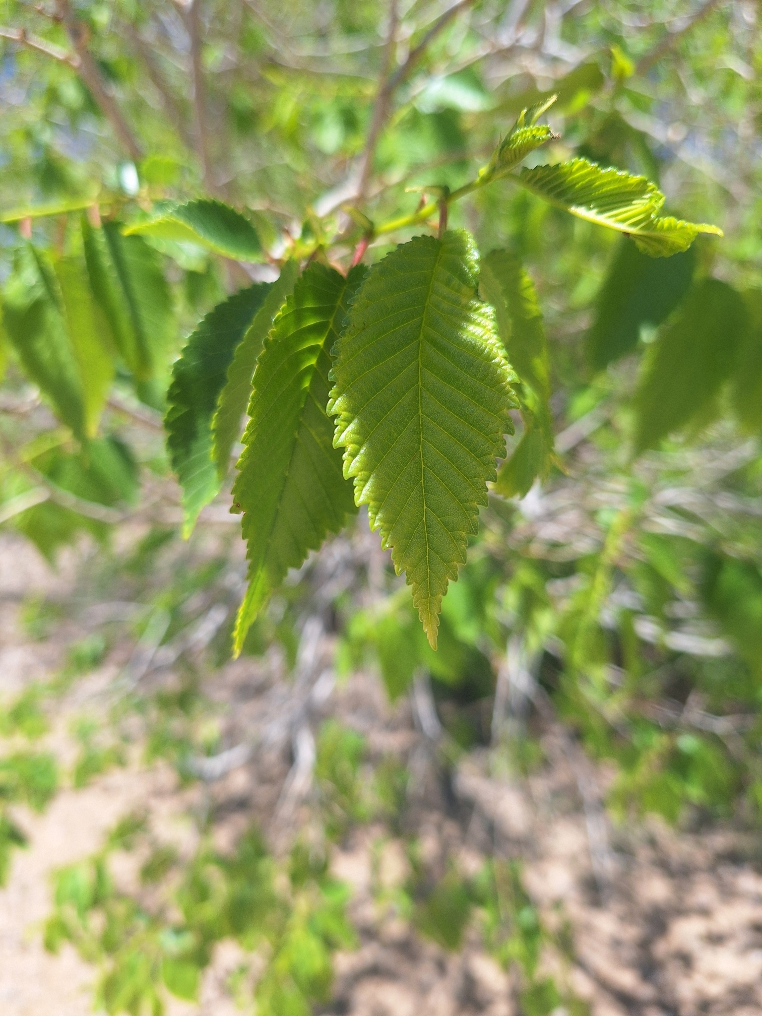
siberianelm-leaves
Siberian elm leaves are lance-shaped to oblong, alternate on the stem, 1-3 inches in length, with serrated or toothed margins
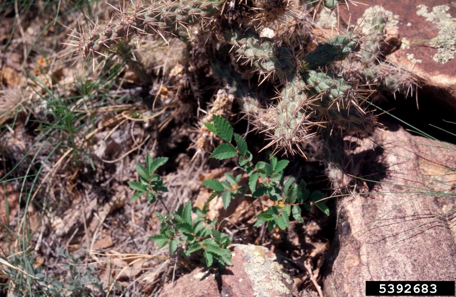
siberianelm-saplings
Young Siberian elm seeds can sprout from under tiny openings, including rocks and concrete, often causing damage to structures as the tree grows
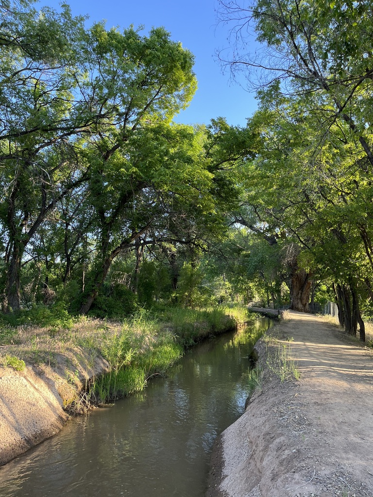
siberianelm-riparian
Siberian elm displace native riparian vegetation such as Cottonwoods
Gallery: Grid, Portrait
Image Title and Caption via Media Library
siberianelm-foliageseeds
Siberian elm is known for releasing prolific amounts of papery seed pods, which can become a nuisance in the urban settling
siberianelm-leaves
Siberian elm leaves are lance-shaped to oblong, alternate on the stem, 1-3 inches in length, with serrated or toothed margins
siberianelm-saplings
Young Siberian elm seeds can sprout from under tiny openings, including rocks and concrete, often causing damage to structures as the tree grows
siberianelm-riparian
Siberian elm displace native riparian vegetation such as Cottonwoods
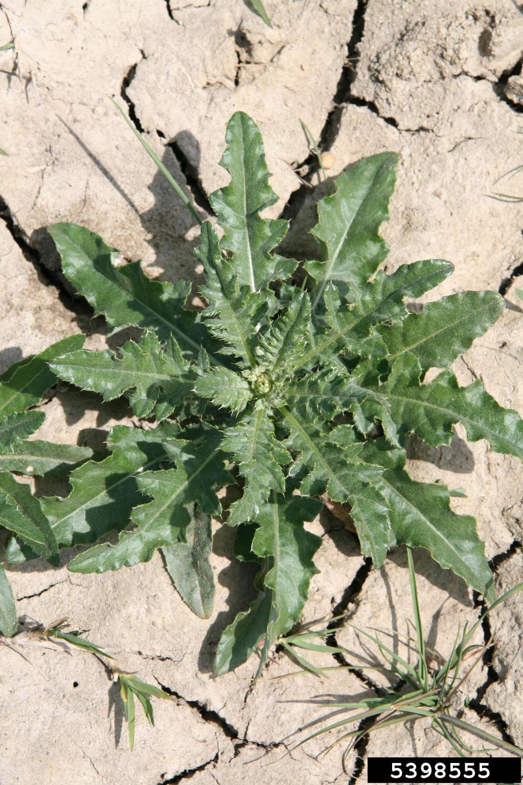
canadathistle-roundrosette
Canada thistle rosette getting ready to bolt in its second year of growth
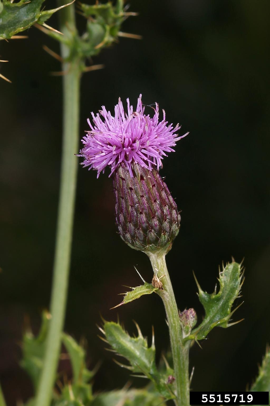
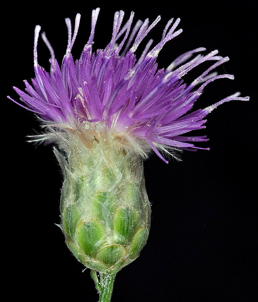
canadathistle-flower
Canada thistle flowers are less than an inch in diameter and usually purple to pink in color, though white is also possible.
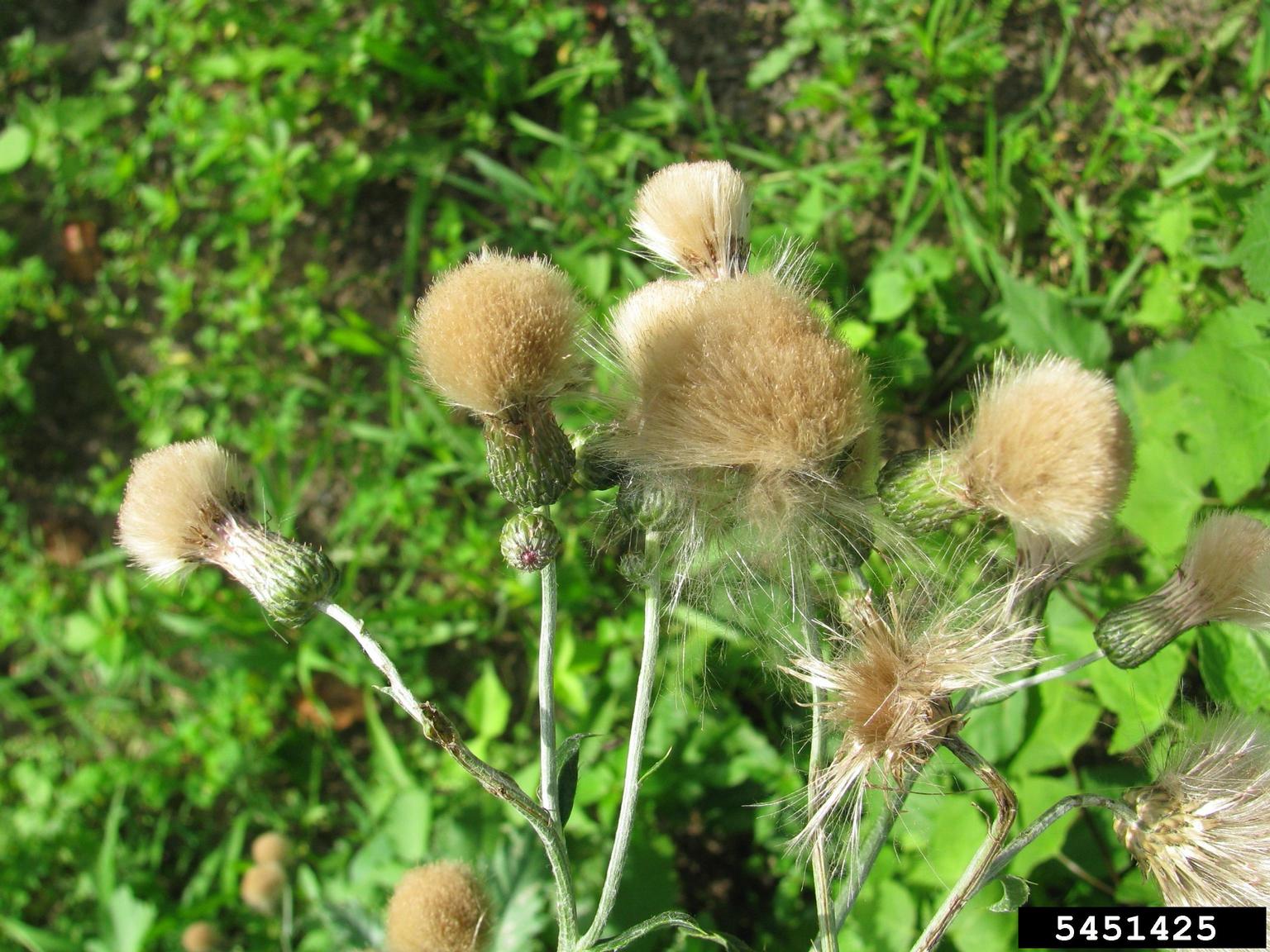
canadathistle-seedheads
Fluffy pappus becomes apparent in Canada Thistle after flowering when seeds have fully matured.
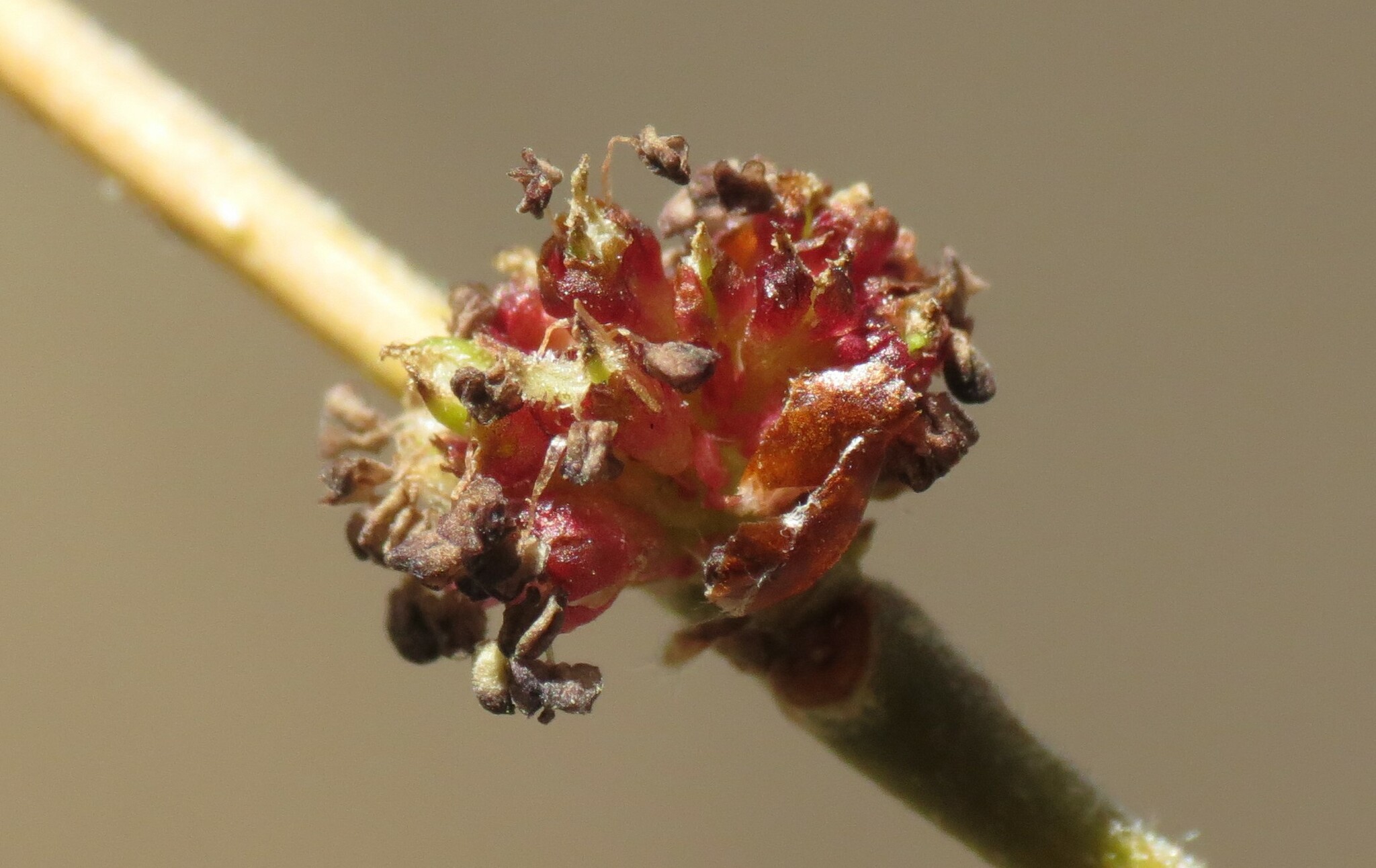
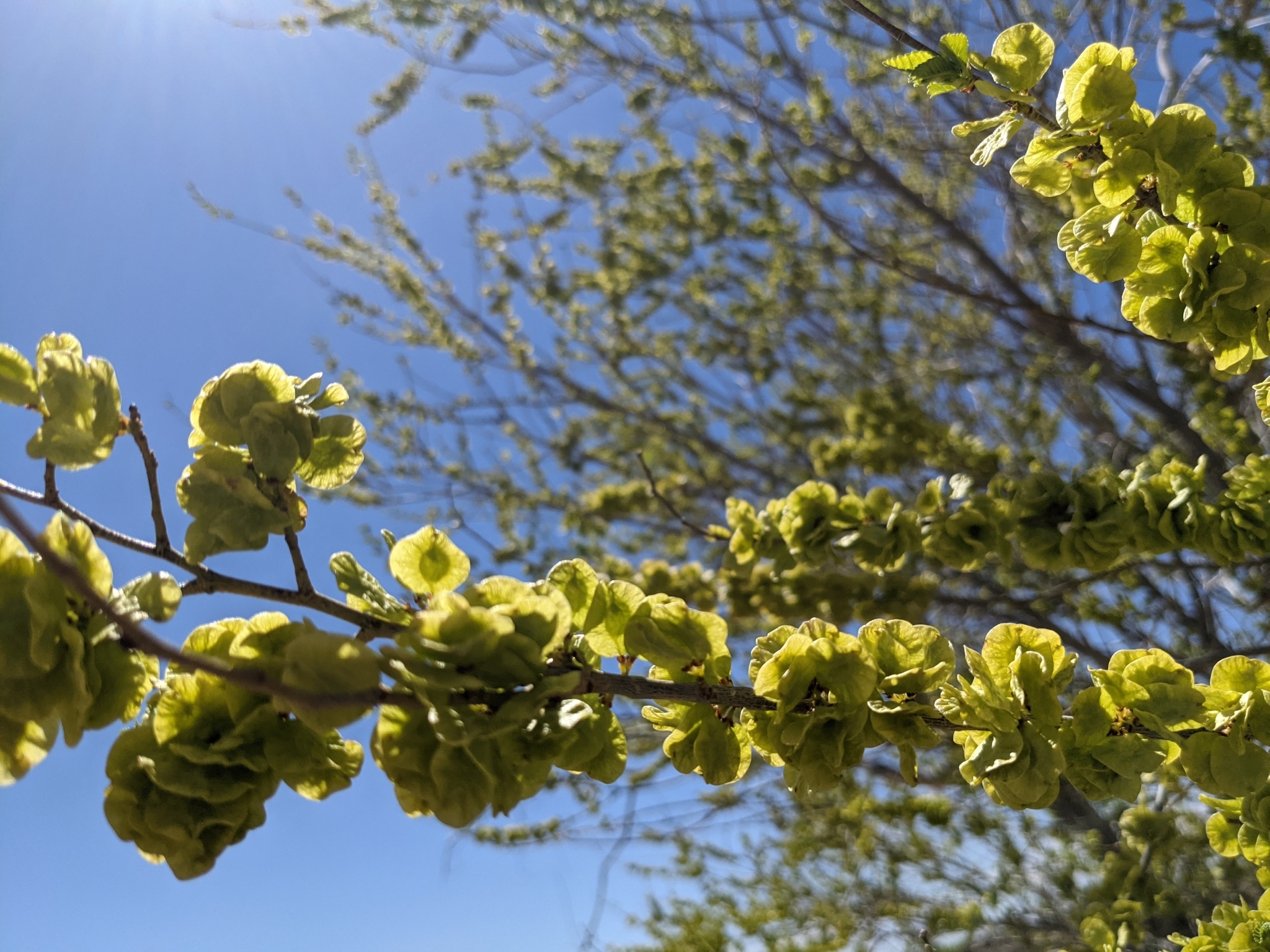
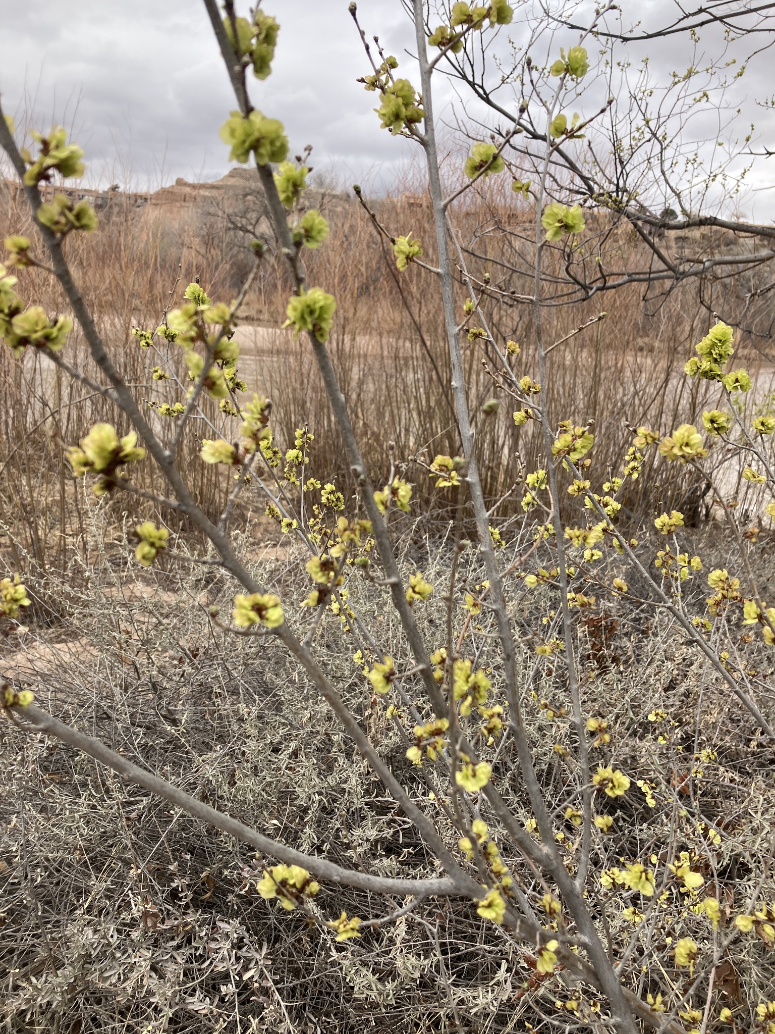
siberianelm-inflorescence
Siberian elms produce small, inconspicuous flowers that grow in clusters on young branches before the leaves emerge in the spring.
canadathistle-deadpappus
Canada thistle plants flower for at least two growing seasons.
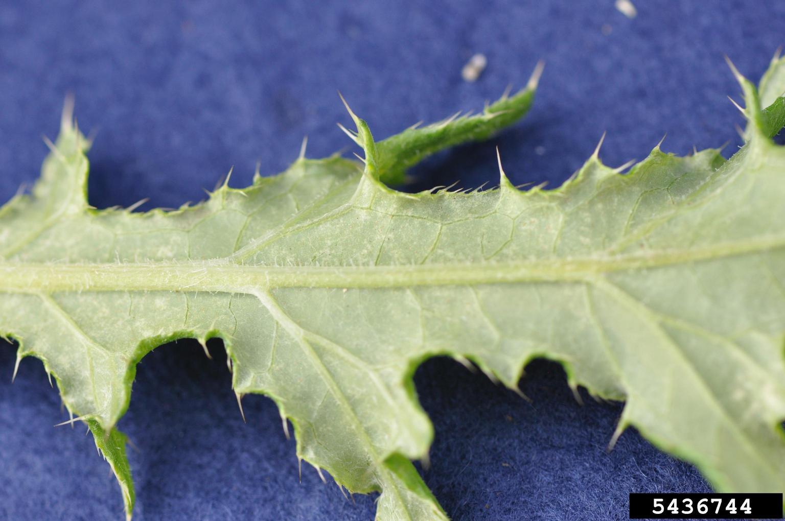
canadathistle-leafback
Leaves are relatively smooth, but the bottom can have tiny woolly hairs along the bottom, especially on the midrib
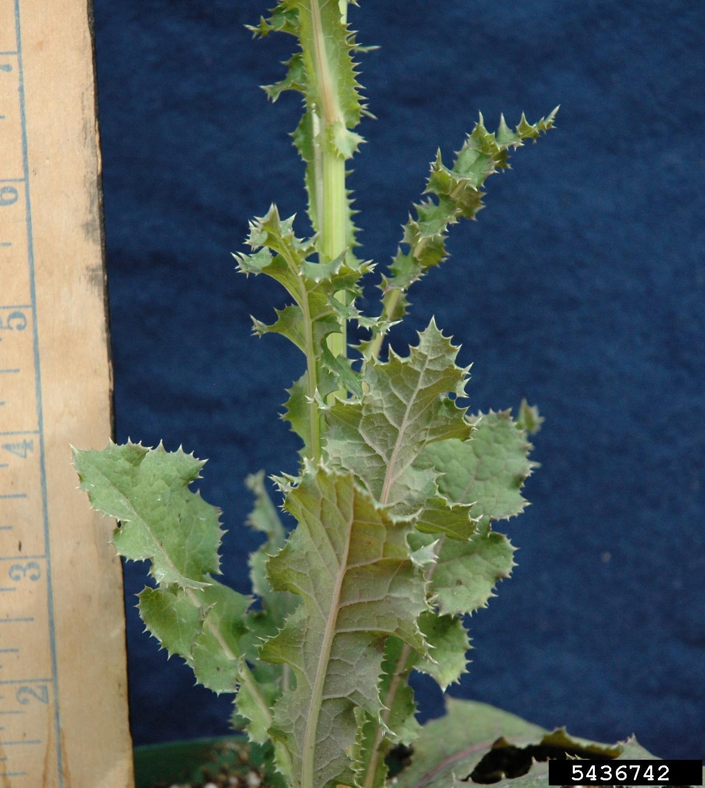
canadathistle-stemleaves
Canada thistle develop branches from a central stem with several large leaves emerging from it.
2 Column; Gallery Slider, Image Title w/Caption (via Media Library)
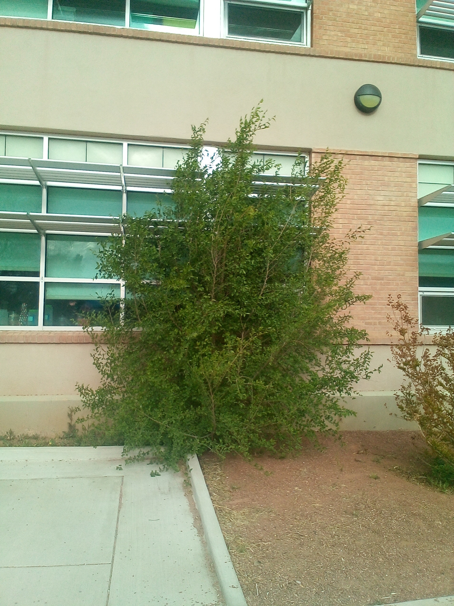
siberianelm-bush
In marginal growing conditions, Siberian elm can present as more of a bush than a tree
siberianelm-inflorescence
Siberian elms produce small, inconspicuous flowers that grow in clusters on young branches before the leaves emerge in the spring.
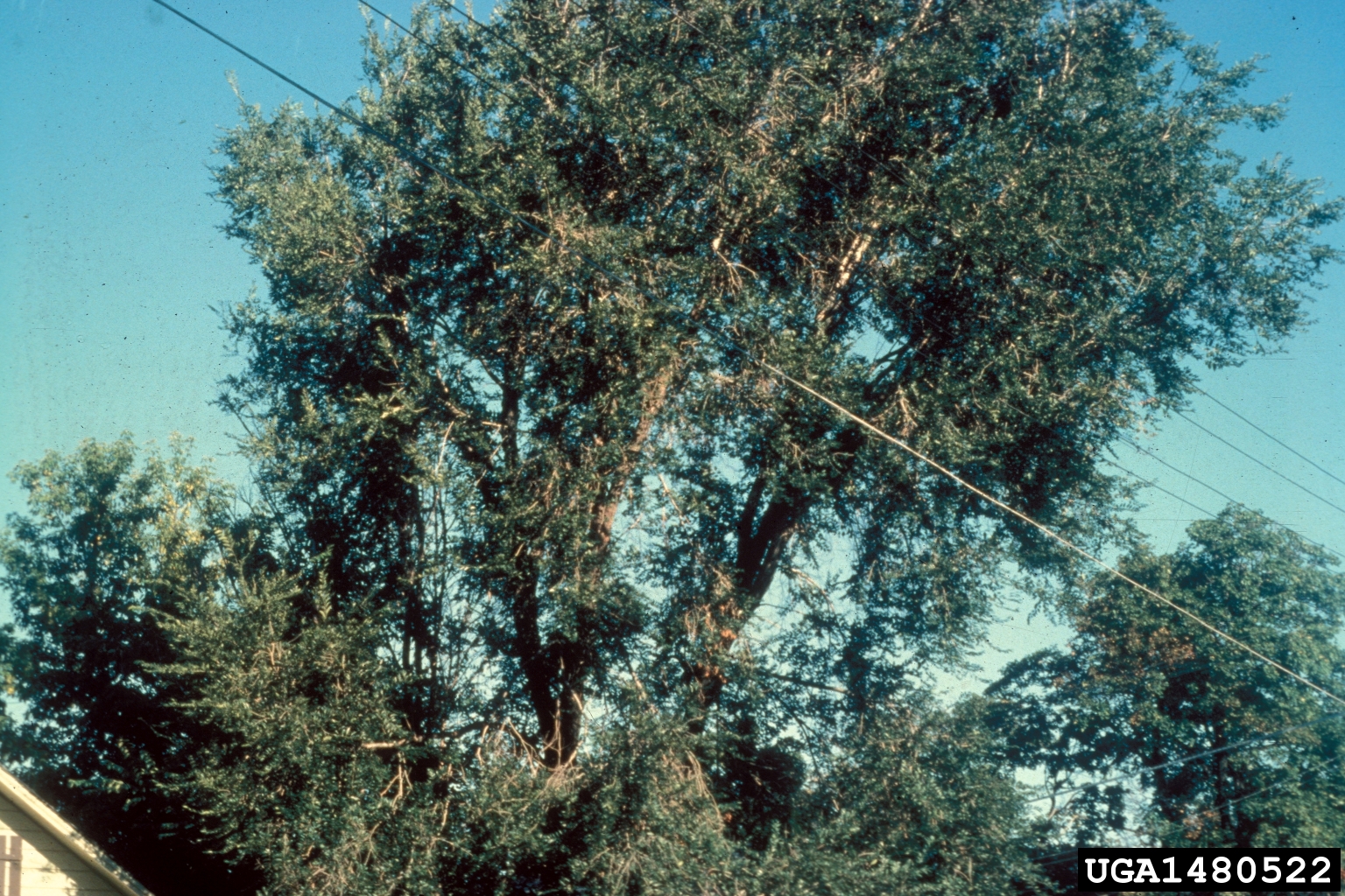
siberianelm-crowns
Siberian elm has an open, broadly rounded crown; dead branches are common; trunk is slender and quickly divides into large, wide-spreading limbs
siberianelm-maturebark
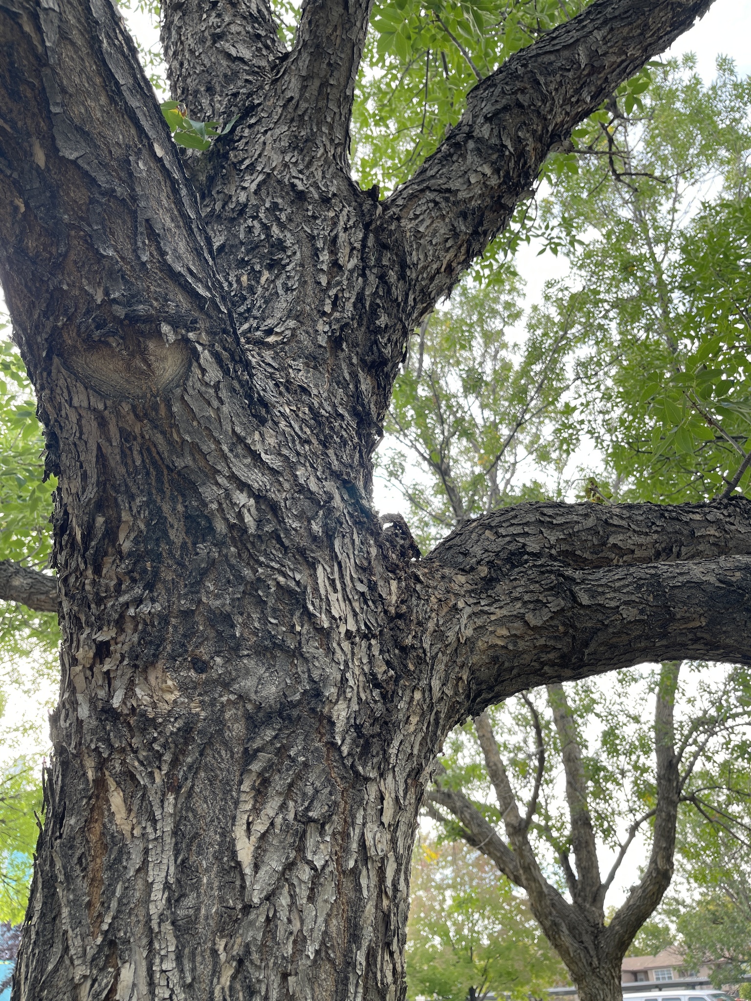
Mature Siberian elm bark looks progressively more ragged, but always has characteristic network of broad interlaced ridges
siberianelm-seedclusters
Once pollinated in the spring, the inconspicuous flower clusters give way to the papery Siberian elm seeds we are so familiar with. They develop on the branch and await to be dispersed by wind or rain.
siberianelm-dryseed
Siberian elm seeds germinate quickly in favorable conditions, but are otherwise short-lived and will dry up and lose viability if they aren’t able to germinate
^^Gallery Module^^: Height Min=500px

Blurb Module
Blurb Body Paragraph
Blurb Module
Blurb Body Paragraph
Blurb Module
Blurb Body Paragraph
Blurb Module
Blurb Body Paragraph
Blurb Module
Blurb Body Paragraph
Blurb Module
Blurb Body Paragraph
Blurb for Image One
Paragraph for Image One
Blurb for Image Two
Paragraph for Image Two
2 Column: Gallery Slider, Gallery w/title & caption
Acroptilon repens
Acroptilon repens
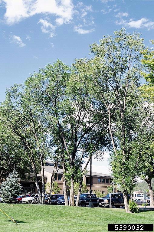
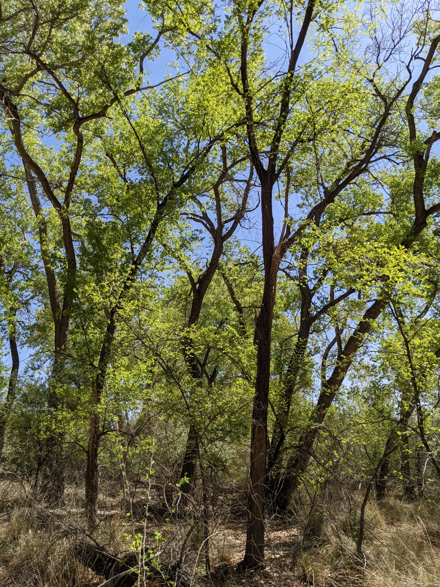
siberianelm-mature
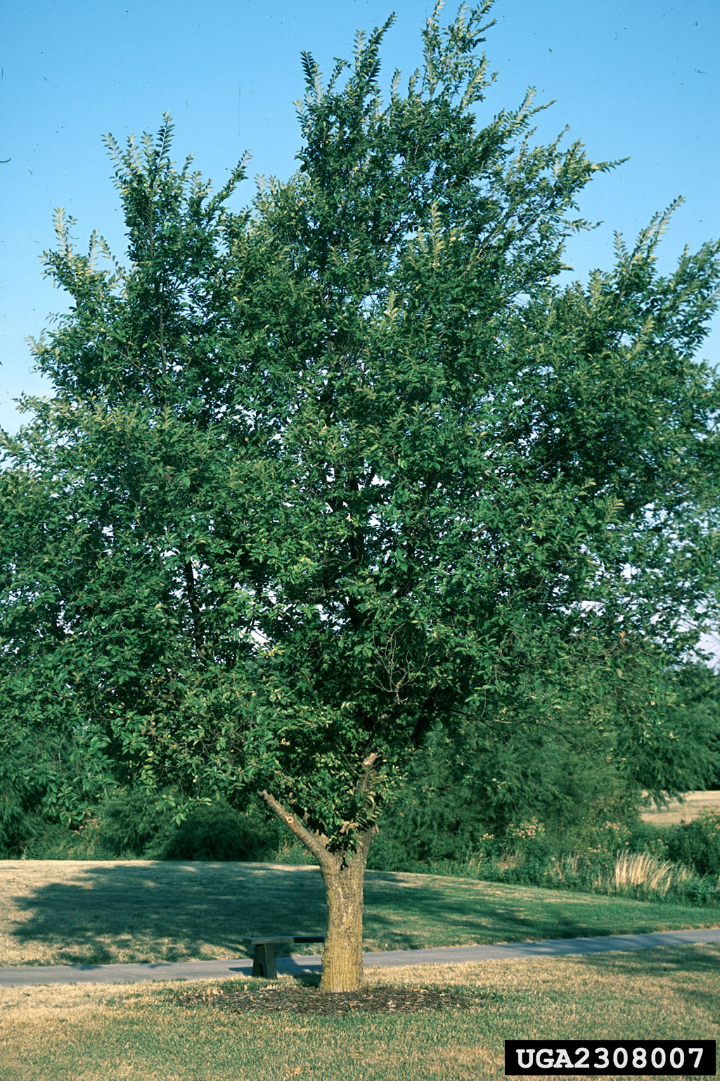
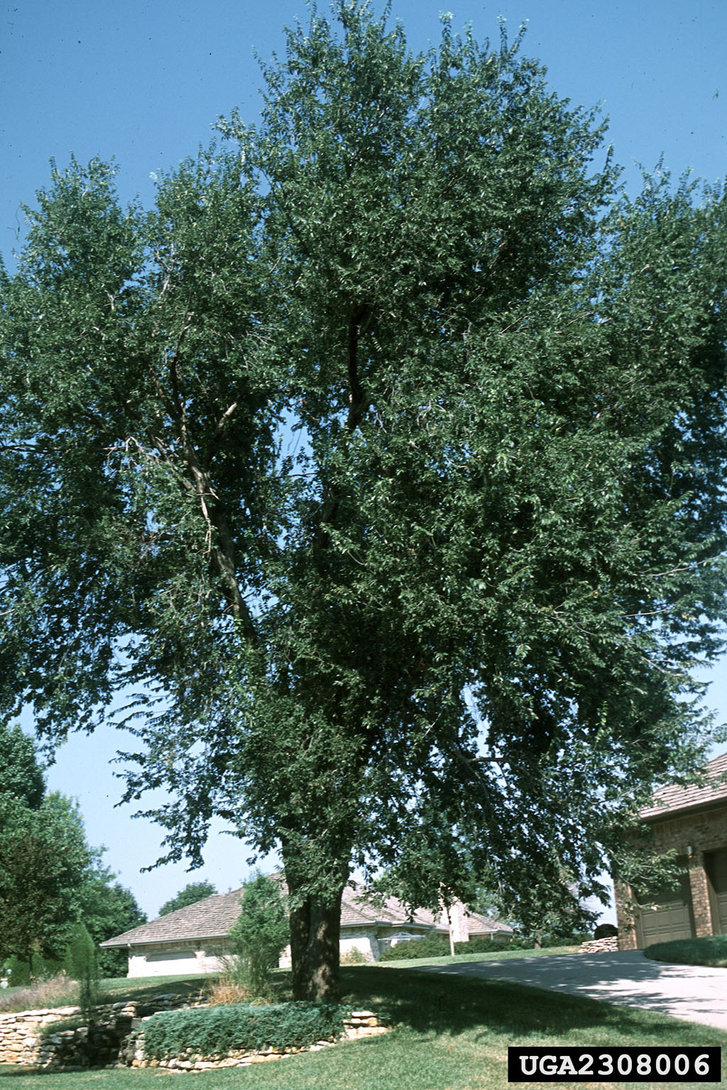
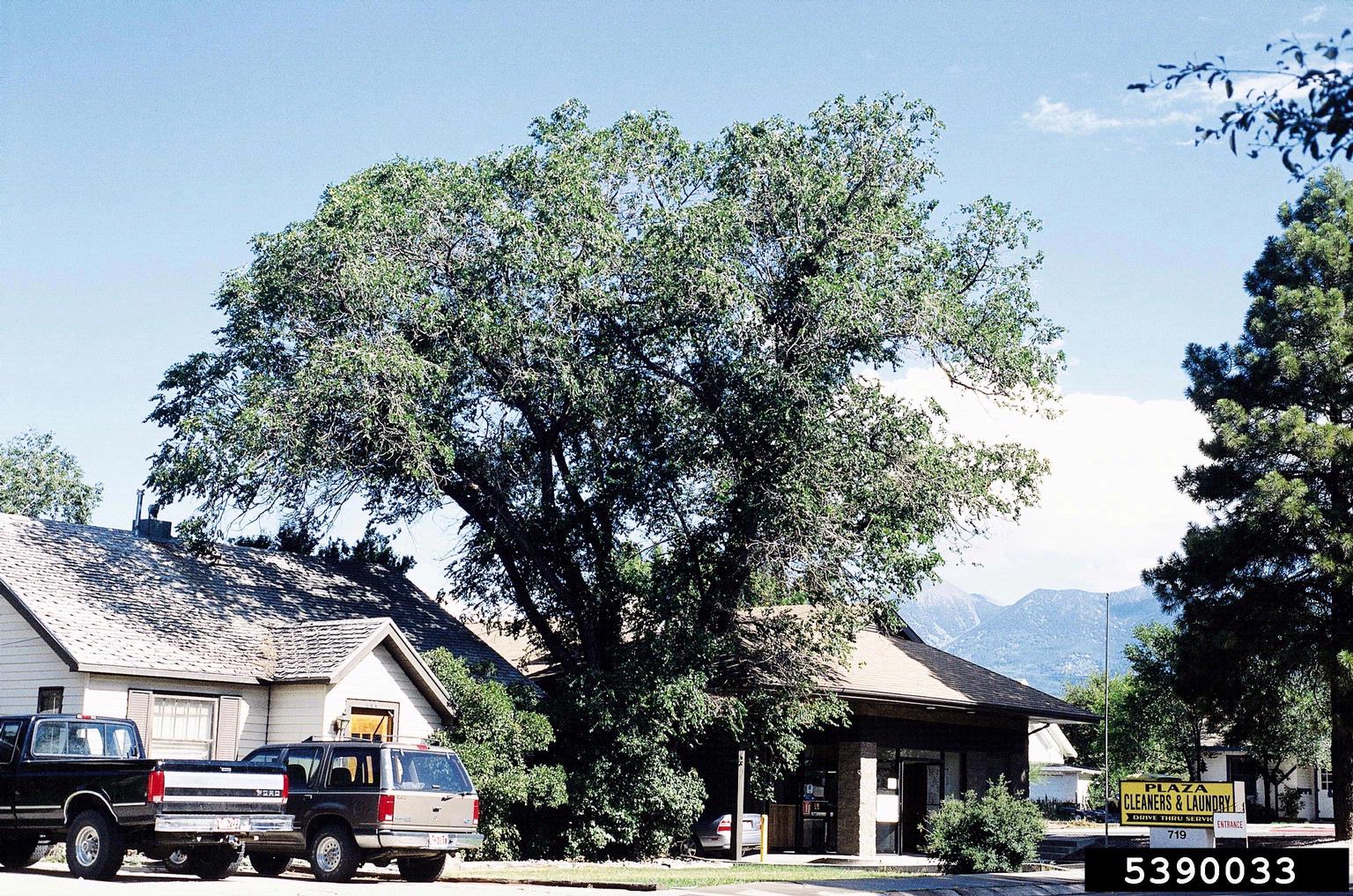
Mature Siberian elms grow up to 70ft tall and are commonly planted as shade trees in urban settings.
siberianelm-yellowleaves
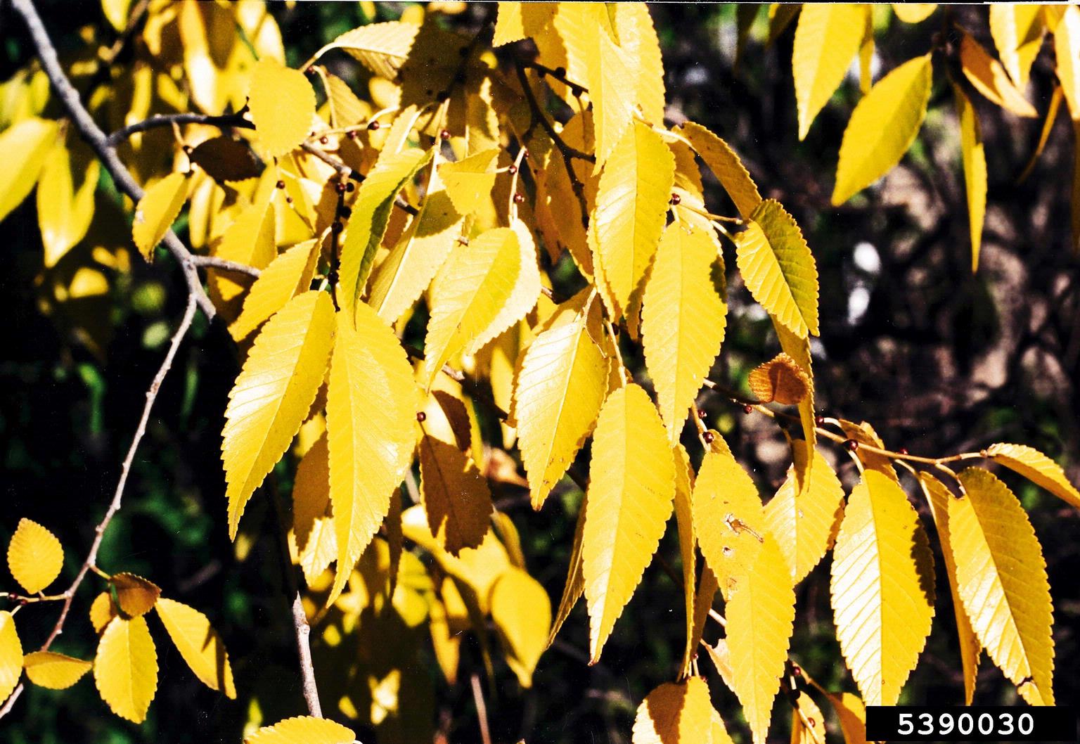
Siberian elm leaves turn yellow in the fall
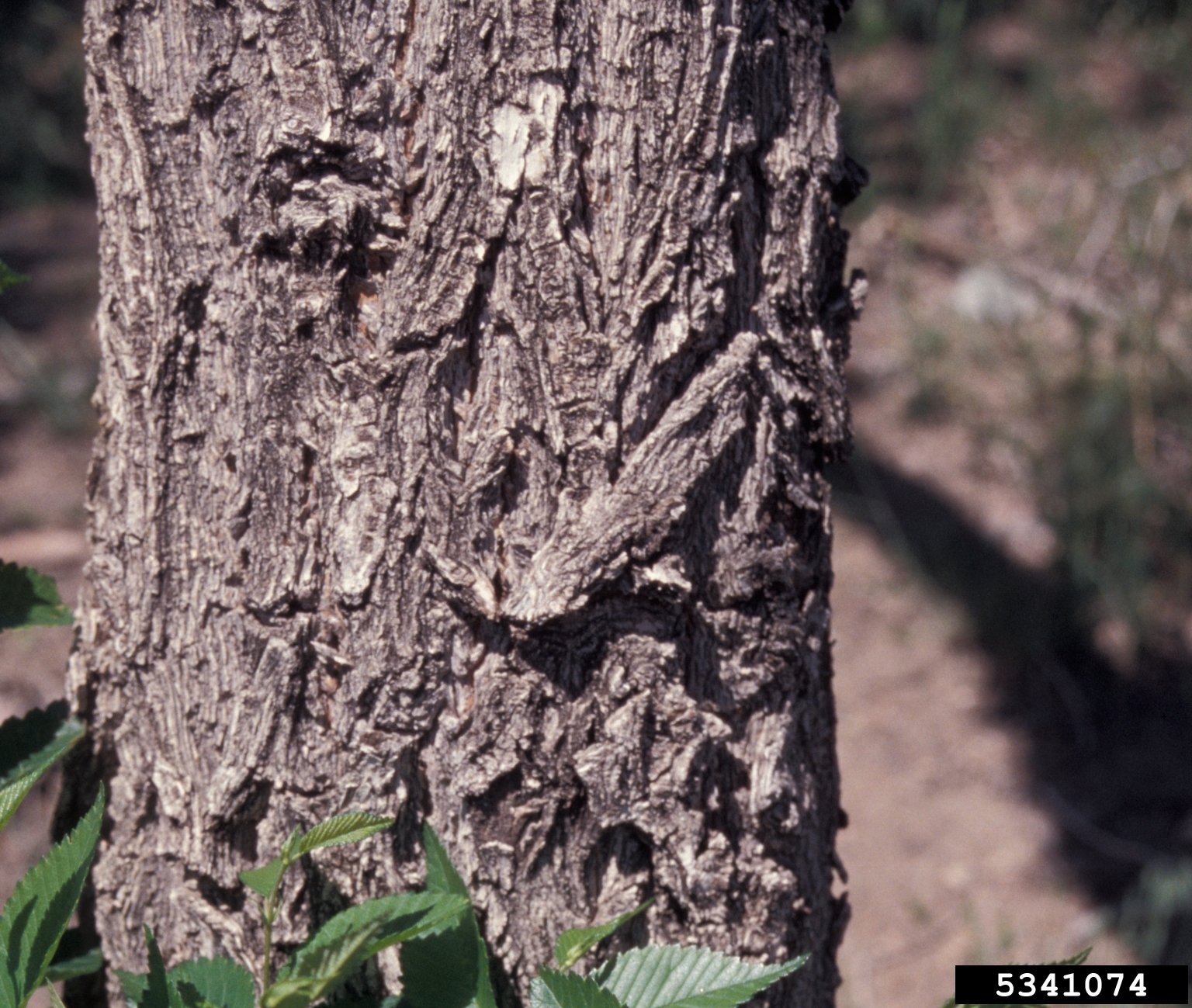
siberianelm-bark
The bark of Siberian elm is dark grey, deeply grooved with a rough texture, especially as it ages. Younger trees may have a more uniform texture composed of interlocking narrow plates.
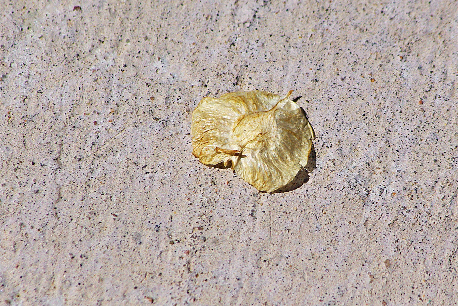
siberianelm-seeds
Siberian elm seeds are flat, small, and round- or oval-shaped; the main seed is surrounded by a thin papery wing, slightly translucent and light green to yellow or tan; distinctive brown tip
siberianelm-adult
Siberian elms are often intentionally planted as shade along walkways
siberianelm-ornamental
Siberian elms were promoted as hardy ornamentals by the US Forest Service
siberianelm-hazard
This Siberian elm growing into power infrastructure creates an electrical hazard if the branches were to collapse or catch fire
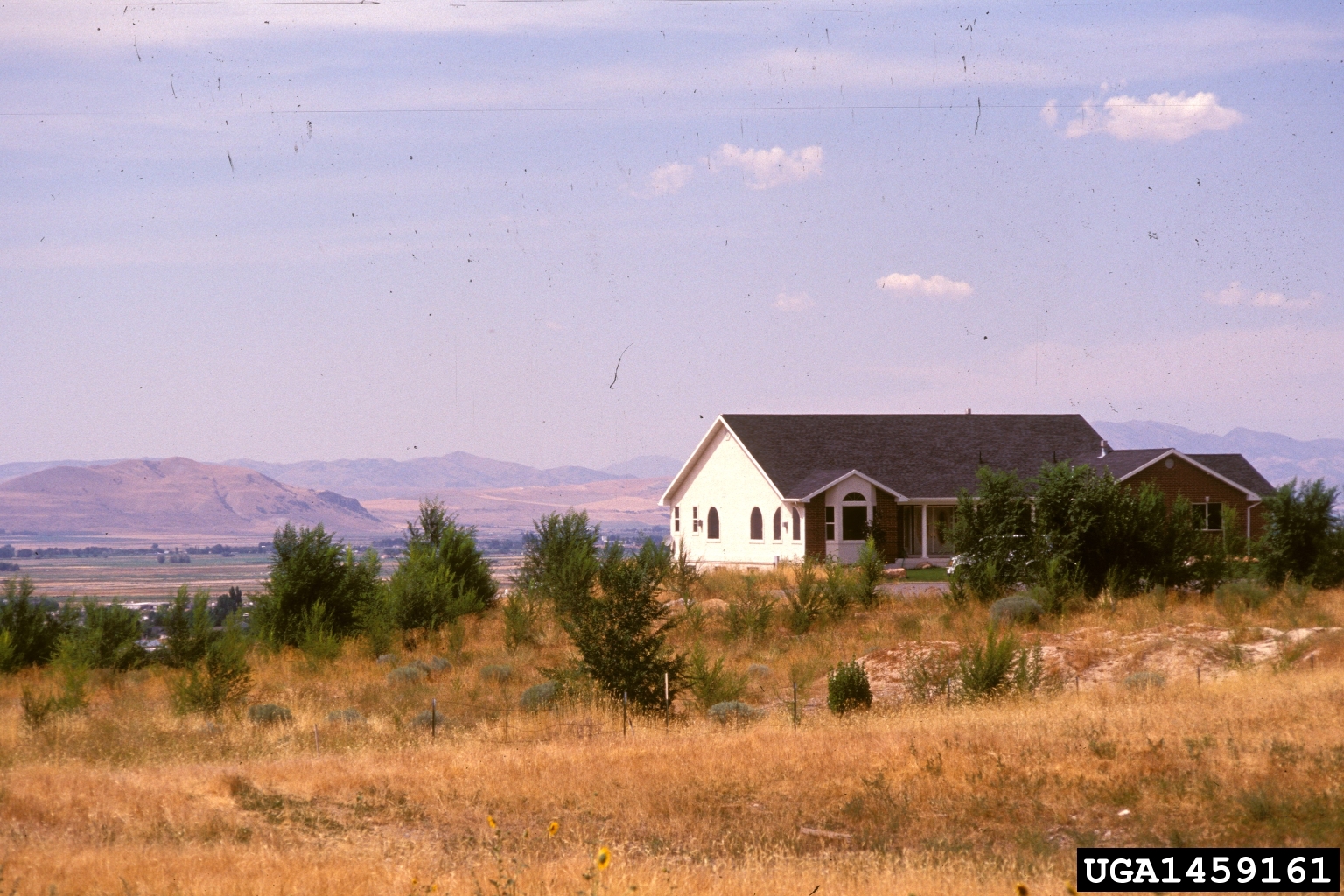
siberianelm-windbreak
Siberian elms were promoted by the federal government as windbreak to prevent soil erosion
siberianelm-leaves2
Young stems and buds can sometimes have a reddish appearance
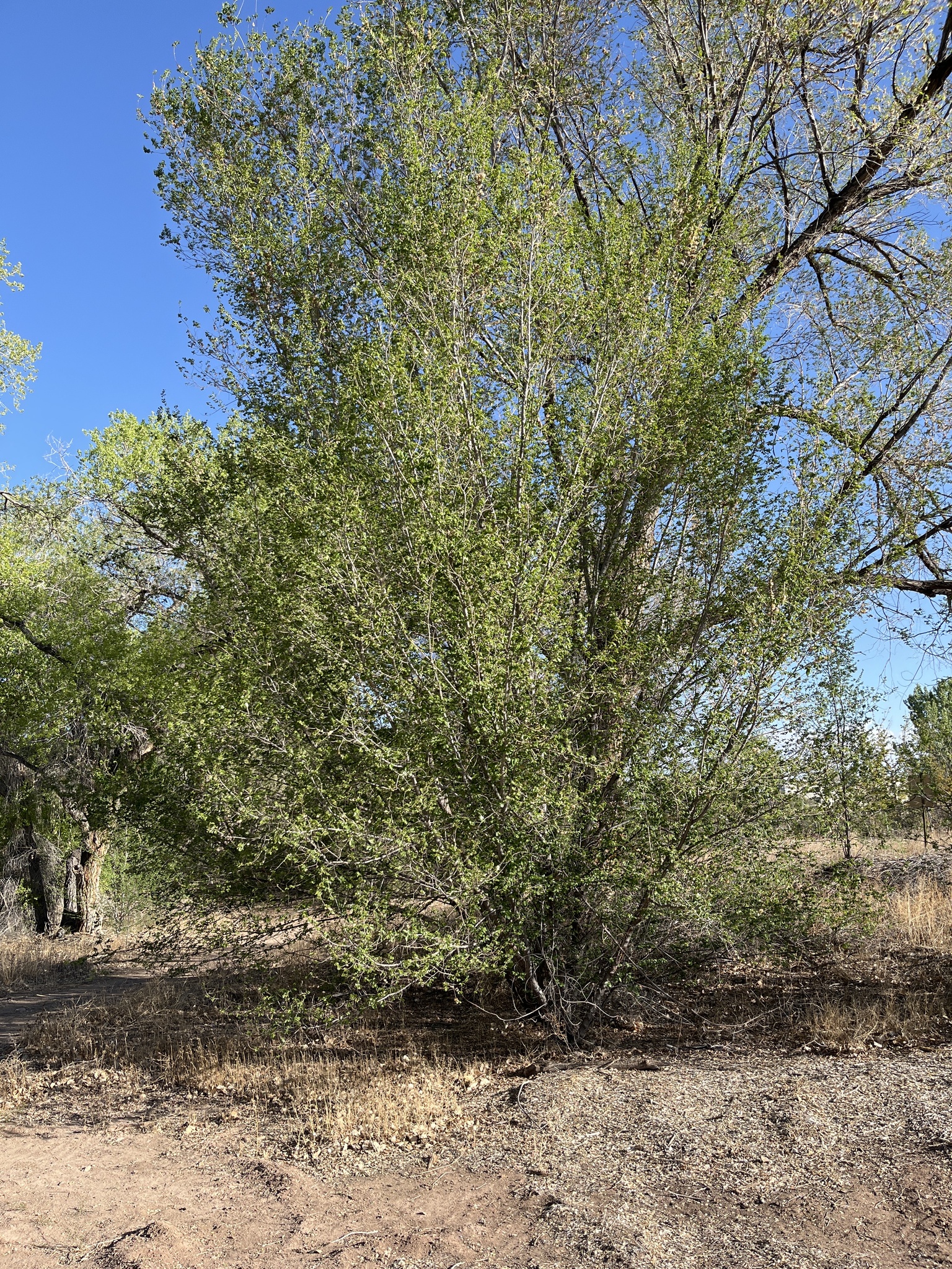
siberianelm- dryland
Under dry conditions, Siberian elm is likely to remain a large shrub. In this image, you can see how some of the limbs may be able to outgrow the others, which may form the primary trunk for a Siberian elm tree at some point
Slider
Your Title Goes Here

Custom Divi 4
Your content goes here. Edit or remove this text inline or in the module Content settings. You can also style every aspect of this content in the module Design settings and even apply custom CSS to this text in the module Advanced settings.
Slider Two
Slide One of Three
Custom Divi 4
Your content goes here. Edit or remove this text inline or in the module Content settings. You can also style every aspect of this content in the module Design settings and even apply custom CSS to this text in the module Advanced settings.

Gallery Module Settings: Design, Sizing, Min Height = 500px; Spacing, Padding TR= 10px
Custom CSS for Hover State, Title no display in Lightbox
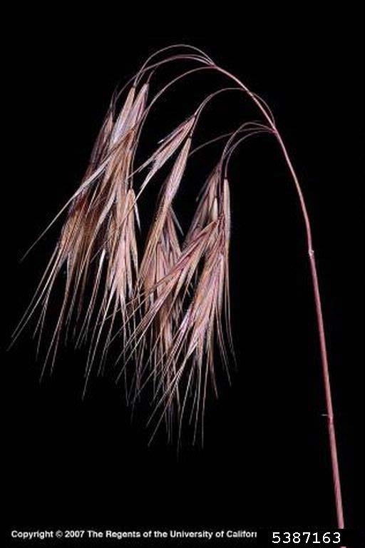
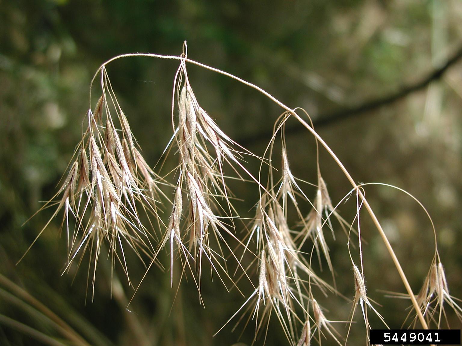
cheatgrass-dryfloret
Dead cheatgrass turns fully brown or tan; the florets are now very dry and spikey. At this point, it can injure livestock and horses if consumed.
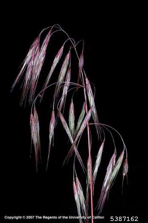
cheatgrass-maturefloret
Another example of cheatgrass florets beginning to turn purple.
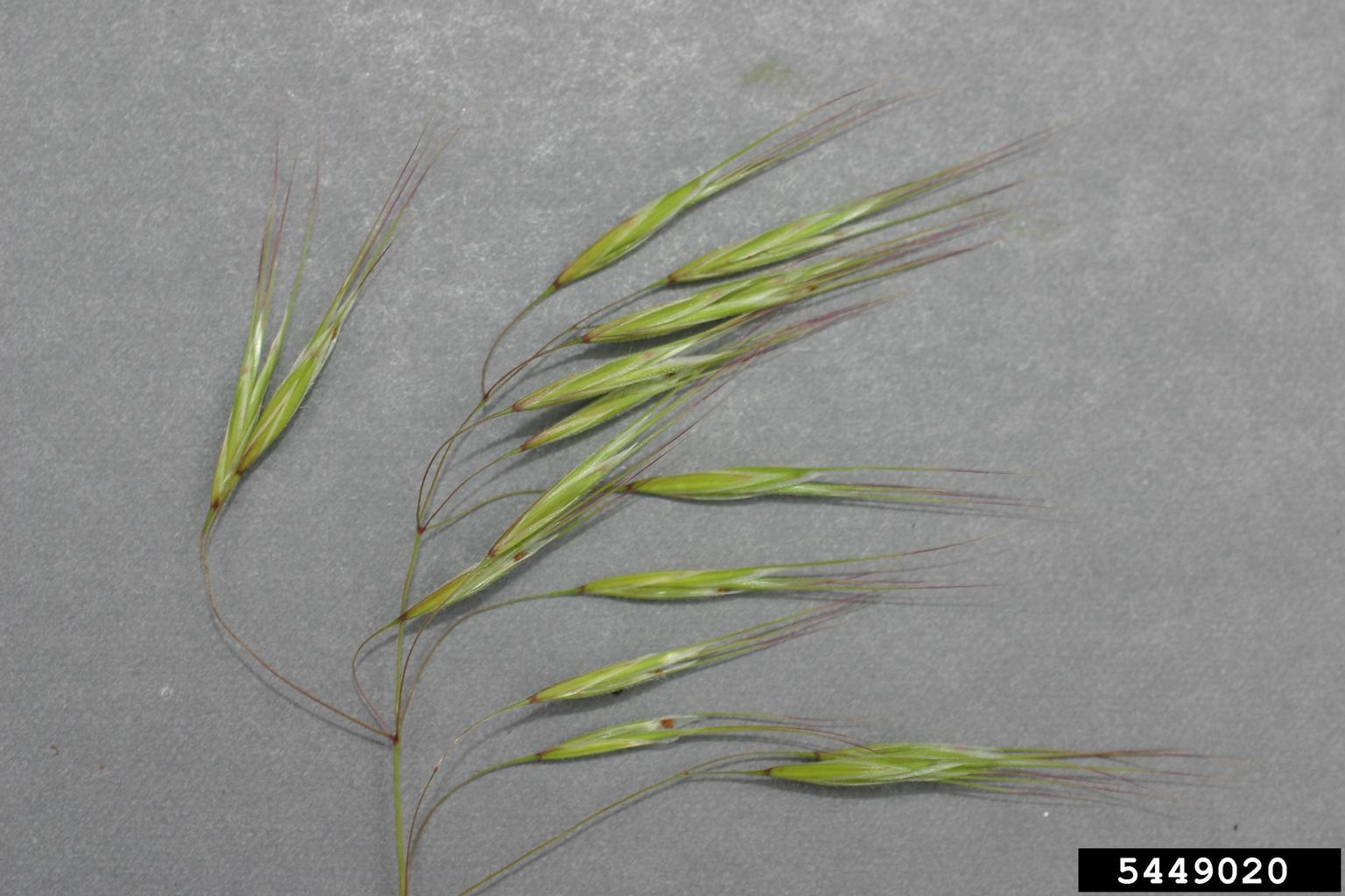
cheatgrass-florets2
Young cheatgrass florets; at this point they may be safe and palatable for livestock.
cheatgrass-florets
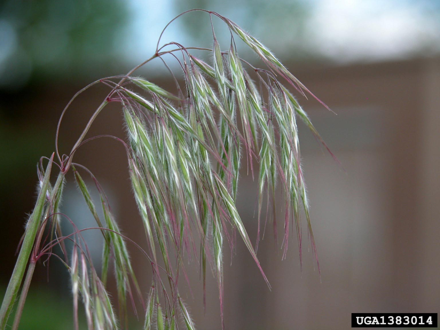
Tips and stems of florests begin to turn purple as the plant matures.

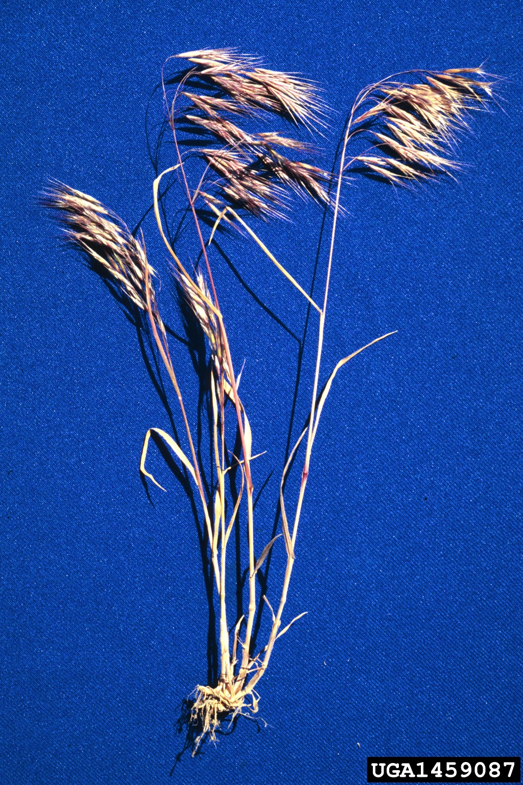
cheatgrass-mature
At the end of its life cycle, cheatgrass plant has turned brownish-red and is no longer good forage.
cheatgrass-deadflorets
Fully dead cheatgrass florets can injure the throats and digestive tracts of animals
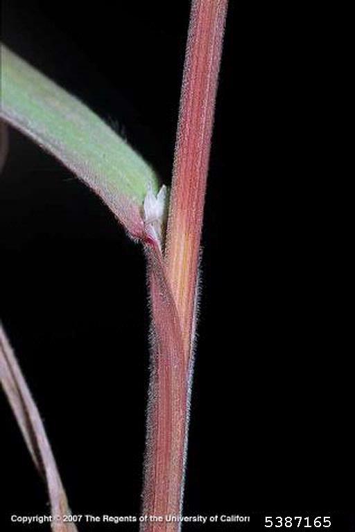
cheatgrass-stem
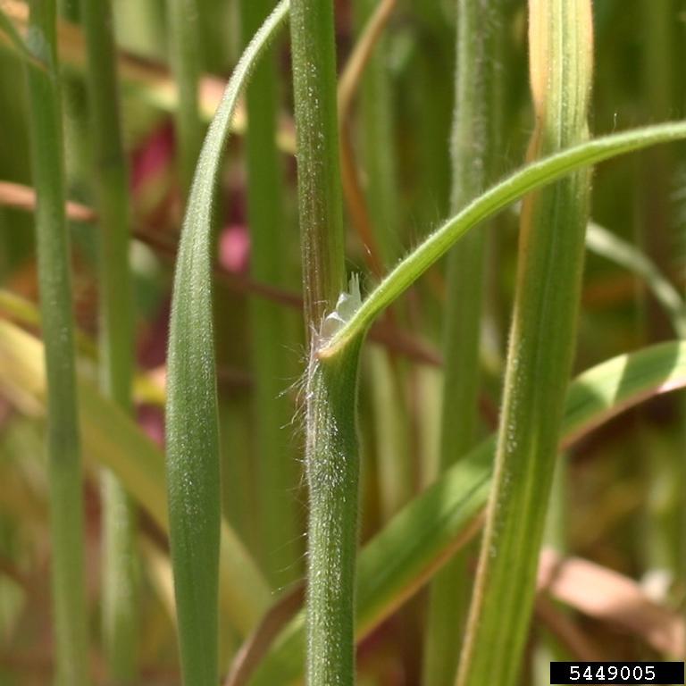
Cheatgrass stems begin to turn red as the plant matures, note the thin white collar-like ligule at the base of the leaf blade.
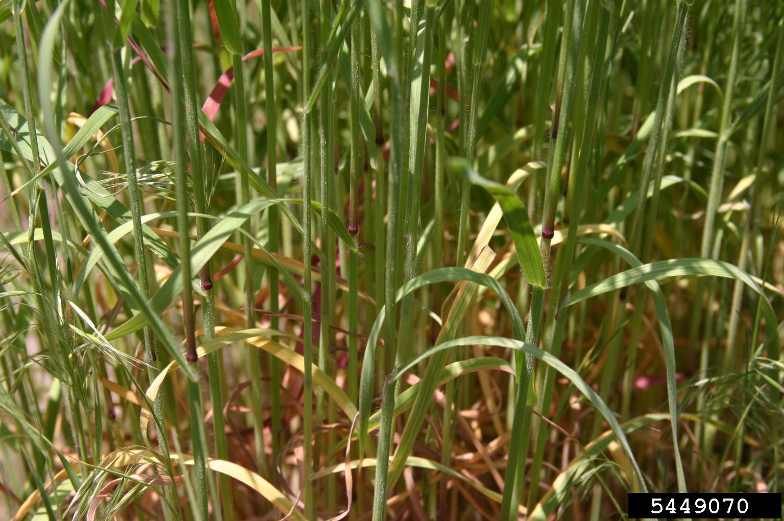
cheatgrass-stems
A community of cheatgrass stems; it is not uncommon for some of the foliage to turn yellow prematurely, especially during dry times.
cheatgrass-leaf
The leaf blade emerges from the sheath, which reaches up from the base of the plant.
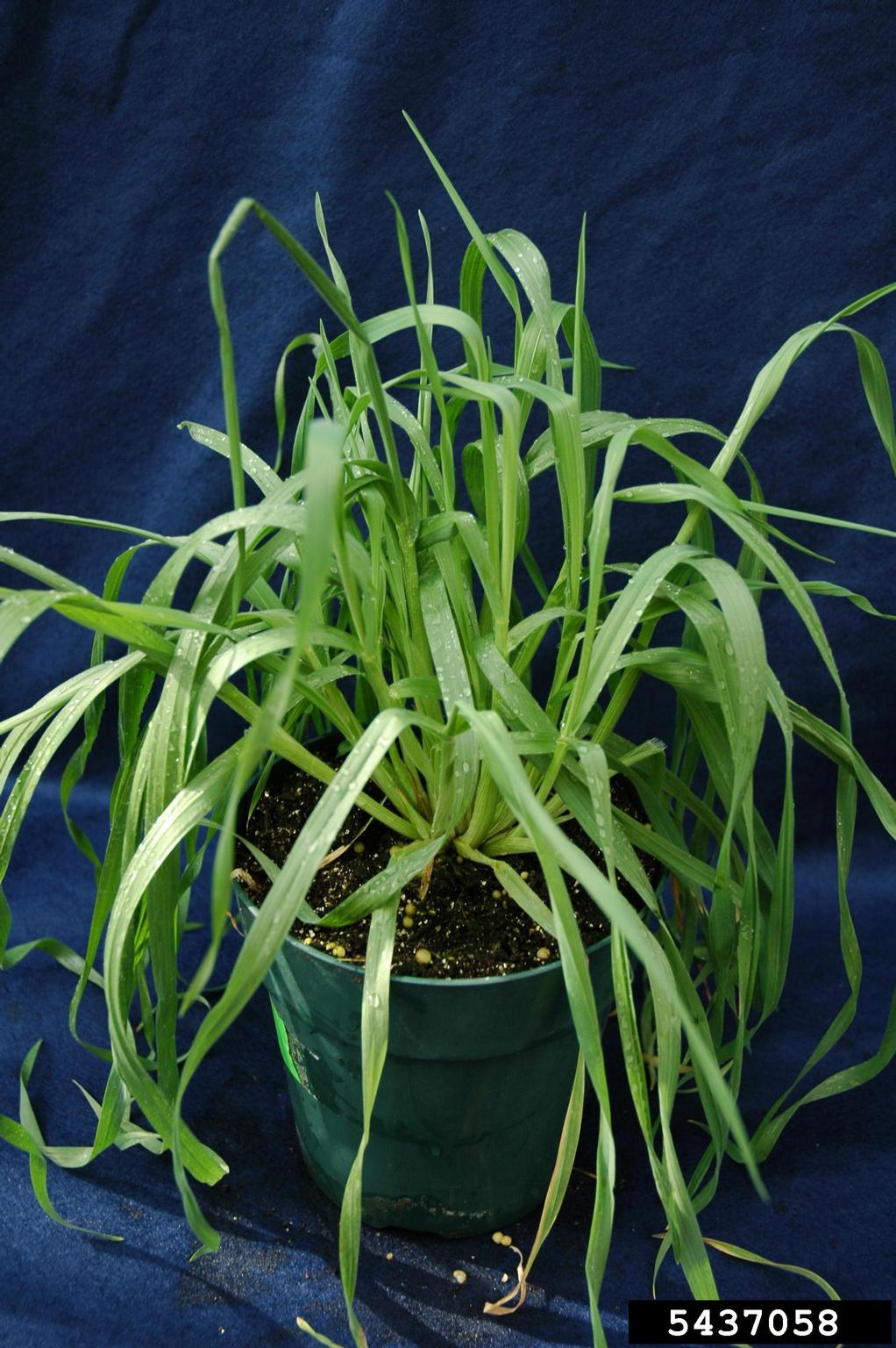
cheatgrass-immature
Immature, non-reproductive cheatgrass foliage; the foliage is soft and palatable, and no florets have emerged.
^ Slider Module Missing from Above ^
Blurb Module
Your content goes here. Edit or remove this text inline or in the module Content settings. You can also style every aspect of this content in the module Design settings and even apply custom CSS to this text in the module Advanced settings.
Text Module
Edit or remove this text inline or in the module Content settings. You can also style every aspect of this content in the module Design settings and even apply custom CSS to this text in the module Advanced settings.
Bottom Divider added to Section
Full Width Header
SubtitleYour content goes here. Edit or remove this text inline or in the module Content settings. You can also style every aspect of this content in the module Design settings and even apply custom CSS to this text in the module Advanced settings.
Dark Section
Edit or remove this text inline or in the module Content settings. You can also style every aspect of this content in the module Design settings and even apply custom CSS to this text in the module Advanced settings.
Full Width Section
Your content goes here. Edit or remove this text inline or in the module Content settings. You can also style every aspect of this content in the module Design settings and even apply custom CSS to this text in the module Advanced settings.
Your content goes here. Edit or remove this text inline or in the module Content settings. You can also style every aspect of this content in the module Design settings and even apply custom CSS to this text in the module Advanced settings.
Your content goes here. Edit or remove this text inline or in the module Content settings. You can also style every aspect of this content in the module Design settings and even apply custom CSS to this text in the module Advanced settings.
Call To Action Module
Content: Transparent Background Color
Design: 30px Rounded Corners
Underline Box Shadow, Outer Shadow
Accordion Module
100 px Left Margin
Your Title Goes Here
Your content goes here. Edit or remove this text inline or in the module Content settings. You can also style every aspect of this content in the module Design settings and even apply custom CSS to this text in the module Advanced settings.
Call To Action Module
Content: Transparent Background Color
Design: 30px Rounded Corners
Underline Box Shadow, Outer Shadow
120px Left Margin. Your content goes here. Edit or remove this text inline or in the module Content settings. You can also style every aspect of this content in the module Design settings and even apply custom CSS to this text in the module Advanced settings.
Blurb
50 px Right Margin
Toggle Module
Your content goes here. Edit or remove this text inline or in the module Content settings. You can also style every aspect of this content in the module Design settings and even apply custom CSS to this text in the module Advanced settings.
Second Toggle Added
Your content goes here. Edit or remove this text inline or in the module Content settings. You can also style every aspect of this content in the module Design settings and even apply custom CSS to this text in the module Advanced settings.
Accordion Module
Settings > Design > Toggle
Color Open, Color Closed
Your Title Goes Here
Your content goes here. Edit or remove this text inline or in the module Content settings. You can also style every aspect of this content in the module Design settings and even apply custom CSS to this text in the module Advanced settings.
Your Title Goes Here
Your content goes here. Edit or remove this text inline or in the module Content settings. You can also style every aspect of this content in the module Design settings and even apply custom CSS to this text in the module Advanced settings.
Contact Us
CTA Title
2. ID Guide
What does it look like?
Key Features
- Cheatgrass is a tufted bunchgrass, appearing as solitary bunches or more often as a patch. Individual plants usually grow about 4 to 30 inches tall.
- Leaves are flat blades with a sheath surrounding the stems; both the leaf and the sheath are densely covered with thin hairs. The base of the leaf blade has a short “collar” – a short translucent membrane of thin hairs called a ligule.
- Flowers: While grasses do not have obvious flowers, you will notice the florets, or flowering tops of cheatgrass are dense and slender. They are arranged in a lose, branching cluster of seedheads called a panicle. These seedheads are about 3-6 inches long and have a characteristic drooping behavior, often found nodding along with the breeze.
- When the plants are young, the foliage is soft and green. As cheatgrass matures, the foliage and especially the seedheads become purplish, and later reddish-brown as it dries up. By the time the plant dies, the foliage is brown or tan and the texture becomes very dry, coarse, and spikey.
cheatgrass-dryfloret
Dead cheatgrass turns fully brown or tan; the florets are now very dry and spikey. At this point, it can injure livestock and horses if consumed.
cheatgrass-maturefloret
Another example of cheatgrass florets beginning to turn purple.
cheatgrass-florets2
Young cheatgrass florets; at this point they may be safe and palatable for livestock.
cheatgrass-florets
Tips and stems of florests begin to turn purple as the plant matures.
cheatgrass-mature
At the end of its life cycle, cheatgrass plant has turned brownish-red and is no longer good forage.
cheatgrass-deadflorets
Fully dead cheatgrass florets can injure the throats and digestive tracts of animals
cheatgrass-stem
Cheatgrass stems begin to turn red as the plant matures, note the thin white collar-like ligule at the base of the leaf blade.
cheatgrass-stems
A community of cheatgrass stems; it is not uncommon for some of the foliage to turn yellow prematurely, especially during dry times.
cheatgrass-leaf
The leaf blade emerges from the sheath, which reaches up from the base of the plant.
cheatgrass-immature
Immature, non-reproductive cheatgrass foliage; the foliage is soft and palatable, and no florets have emerged.
Siberian Elm
Slider

Your Title Goes Here
Your content goes here. Edit or remove this text inline or in the module Content settings. You can also style every aspect of this content in the module Design settings and even apply custom CSS to this text in the module Advanced settings.